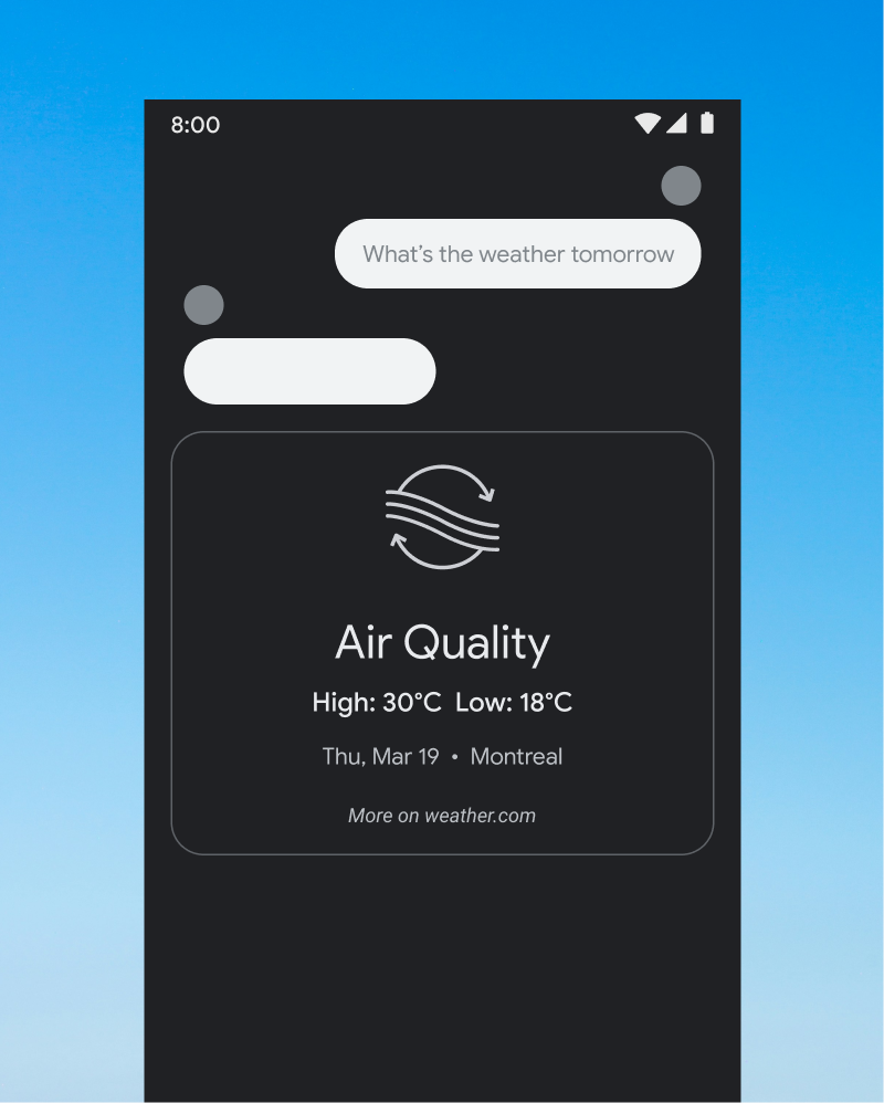
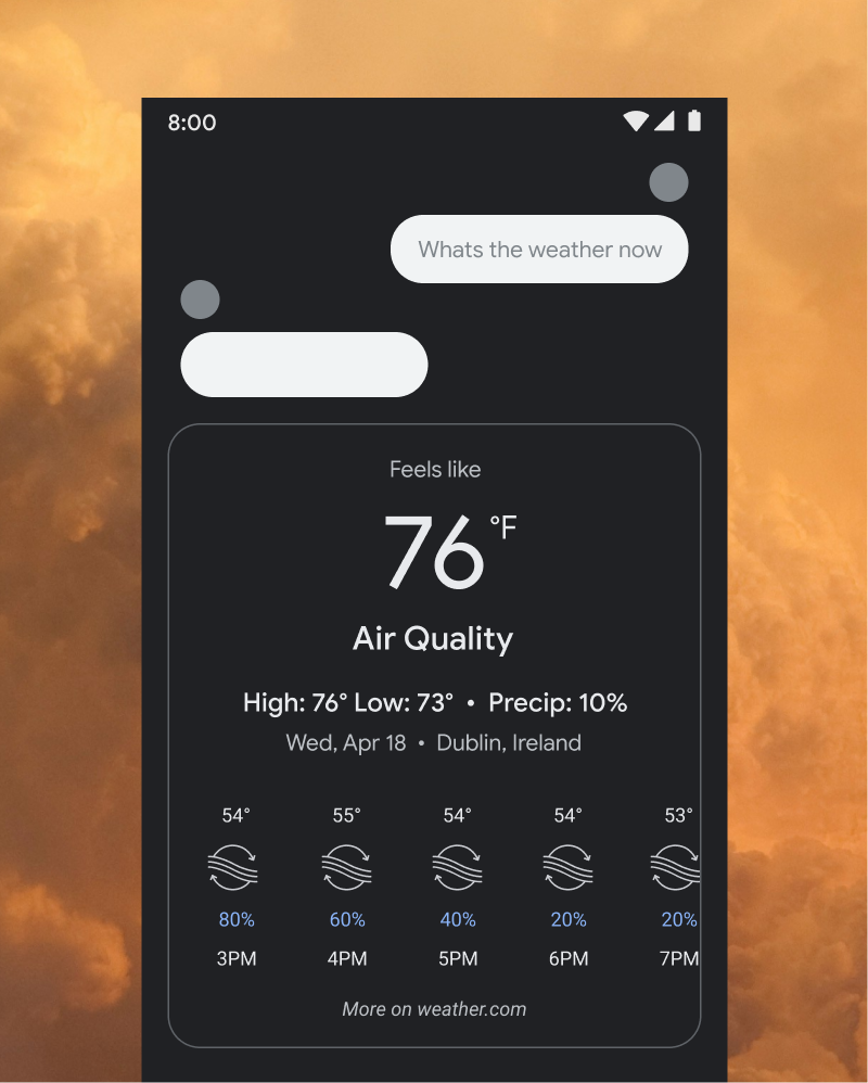
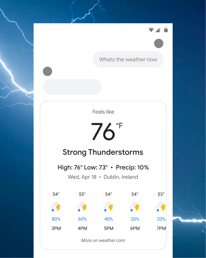
Google Weather Icons
Digital - 2020
I had the opportunity to design a set of 10 new icons for the Google Weather app, focusing on creating a cohesive and intuitive visual language. The goal was to enhance user experience by making the icons instantly recognizable and easy to understand, even at a glance.
The process involved extensive research and iteration to refine the shapes and visual details, ensuring that each icon was both visually appealing and highly functional. I explored different line weights, color palettes, and design styles to align with Google's broader design guidelines while giving the weather icons their own distinct identity.